6 Design Elements That Make a Great SaaS Website
Building a website is a tasking but advantageous process, especially when the website fulfills the purpose it was built — to make a profit. It is no different for SaaS websites.

A ‘Software as a Service’ (SaaS) website is a software delivery method that makes data and services available to users through a browser. These websites have become very popular in the business world today because of their numerous advantages for e-businesses.
In this article, we have listed 6 fundamental design elements to include in your website to make it SaaS-compliant for better sales conversions.
Visually appealing designs

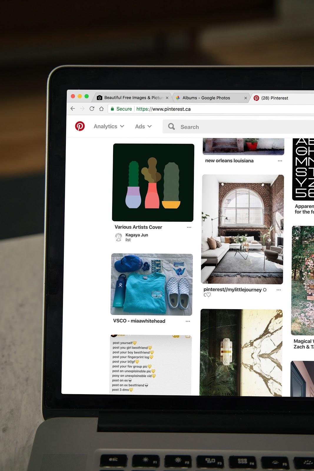
Pay close attention to the visual elements of your website
Human beings are naturally drawn to high-quality visual elements, so it is advisable to use excellent and relevant graphics on your website if you hope to catch your customers’ attention. You can employ the services of website design companies to help you achieve your vision for your website.
When people visit a website, they access it to see if it is professional and trustworthy. Your website must be appealing to them to meet their requirements.
Simple designs and layouts are often more appealing to users than complex designs are. Simplicity is a crucial element when creating a great SaaS website design. If your website is well-arranged and has all the essential elements where the user expects to find them, you help save them a lot of time.
A visually appealing website also helps to build their trust in you and your business. Try to eliminate distractions from your website. To avoid cluttering your website, steer clear of adding a lot of information that may be irrelevant, especially to first-time visitors.
Your visuals should not take the customer’s focus away from the content; instead, they should act as facilitators to the content.
As you choose the font size, font style, colors, and general layout of your website, you should also keep conversion optimization in mind. Promote a sense of familiarity in your design; this would attract and eventually earn you customers.
Note that the elements you use in making your SaaS website should be visually appealing and also persuasive.
User-friendly design

A user-friendly website keeps users on your website longer
You should ensure that your SaaS website can work on all browsers and all devices. With numerous browser options on the internet, it would be foolish to limit your website visitors to only one or two specific browsers or operating systems.
You should be aware of and take advantage of all the possible ways your customers could try to access your website. When you do this, you can then test to make sure your site works on all of them.
Your site should also be mobile-friendly while also being desktop compliant; do not neglect one for the other. Your website could put many people off if there are limitations to accessing most of its features, and by implication, you would lose customers.
As a part of user-friendliness, your SaaS website has to be secure. It will not be a good look if your customers’ information gets compromised while using your website or if they get infected with malware from your site.
An efficient SaaS website should be one that guards against cyber-attacks and security risks. One way to ensure adequate security is to use an HTTPS (HyperText Transfer Protocol Secure) certificate on your site.
To test the compatibility level between your website and its users, try usability testing. Usability testing involves evaluating your products, service, or website by testing it with representative users.
Simply, usability testing checks how easy it is to use a website. Take note of your observations and work on how to make them better.
Easy navigation
Making your website easily navigable makes it easy to convert visits to sales. A complex process or system discourages potential customers from using your website.
It’s essential to make your menu items easily accessible from any page the customer is on in website navigation. Your menu should be interactive, not pushing users to frustration. Functionality is crucial.
A site map also comes in handy to let users know where they are and where they would like to be on the website.
In addition to this, your contact information should also be very conspicuous. Every contact information you have should be visible and easy to spot so that users can reach you as soon as they need to. You may lose many business opportunities if your website visitors have no means to contact you about your services.
If they have questions about your services and cannot contact you, they may leave the site right away, leading to possible loss of future website engagements. Your website’s homepage is a good location to display your contact number or address.
Call to action(CTA)

Move your web visitors to action with a compelling CTA
It is vital to have a call to action button that compels your users to make a purchase after perusing your website. A website’s call to action tells the user, “it is time to take action.” Most websites have a CTA button that says, Sign up Now! or Get Started.
Whichever direction you take, you have to test your call to action to see which message works best for you. It is ideal for your CTA message to be short but compelling. The design of your CTA button, the message or text it contains, the color of the button, and even the number of CTAs on the website all play crucial roles in determining the effectiveness of your website’s conversion.
There are several SaaS websites out there performing the same services as you. Your call to action must be so captivating that your likely customers will not go to your competition.
The effectiveness of your website’s CTA could influence your Average Revenue per User (ARPU). ARPU is used to assess a company’s ability to generate revenue at the per-customer level. If your CTA is ineffective, you would have a low ARPU rate.
On the other hand, if you have a very compelling CTA, your ARPU would be on the rise. CTAs guide the users towards your conversion goal. But not only that, the call to action is always needed at the point of conversion, making it one of the most critical elements of your website.
Pictures and videos of products

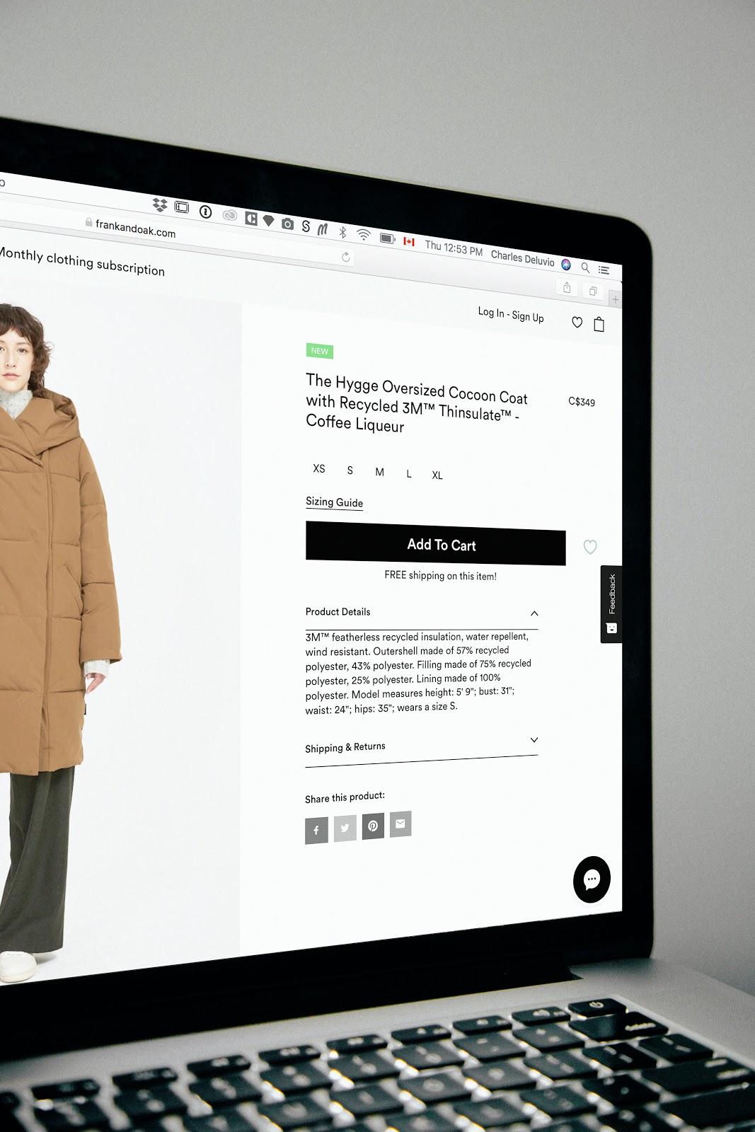
Use high-resolution pictures and videos to showcase your products
Imagine being on a website that sells products, and you cannot see photos of those products. It’s not only weird, but it is also suspicious. Not having pictorial proof of the products and services you offer on your website could deter possible customers from patronizing you, thereby reducing your conversion rate.
Your conversion rate is the number of visitors to your website that carry out your desired actions.
Many people will not pay for products they cannot see; this shows just how necessary it is to have high-quality pictures, and if possible, videos of your products on your SaaS website. Try as much as you can to avoid low-resolution and needless images, which could diminish user experience. You could accompany these pictures with the features and descriptions of the products.
Videos tend to do more justice to products than pictures and even words. Videos that span between 30 seconds and 1 minute can showcase your services. They help your users to understand your products even better, and this will increase the chances of them making use of your services.
If you cannot afford to pay extra for video hosting or analytics, you can make use of free services such as YouTube for your videos.
Free trials and demos

People like free things, take advantage of that!
Offering free trials is quite common among SaaS companies. Free trials allow your customers to use your product or service for free, but for a limited time. This will help them learn more about your offers and even know the product’s value before they pay for it. Most free trials last for about 2 to 4 weeks.
Demos provide the opportunity for your users to test-run your products. They help visitors on your website, try out your product without going through all the technicalities. Demos are simply demonstrations of the core features, capacities, and uses of a product or service.
Visitors should have access to your demos with just a click of a button. When you make your demos simple, straightforward, and stress-free, you increase your chances of wooing over visitors and possibly gain some long-lasting clientele.
While a free trial lets prospective customers find out the value of your services, a demo will show and tell customers how to use the product. Demos are visual explanations of the uses of the product, whereas free trials allow customers to try out the product themselves.
You could place your free trial or demo button on the homepage, landing page, or pricing page.
Conclusion
Although this list is not exhaustive, it points out some of the most important elements that must never be found missing on your SaaS-enabled website. From the visual design to navigation and even the call to action, these elements determine your website’s success. They have been tried, tested, and proven to be very useful for any SaaS website.
