10 Perfect Examples of Ghost Buttons in Use
You probably do not need an explanation on what a ghost button is; yes, that transparent rectangle thingy that performs the button functions and seems to be on every website for at least a year now.

You might argue it’s not exactly a button, since it lacks a fill, naming it an outline with no fill might be more accurate, but it’s too long and it does perform the functions of a button, so everyone calls it just that – a ghost button.
Ghost button is usually much larger than a traditional button, but due to its “ghost” properties it never obstructs the area behind it and effectively attracts viewer’s attention; thus these buttons are perfect for landing page style websites, and other types of websites that need a strong call-to-action approach. Besides, their modern and unobtrusive look makes them perfect for a minimalistic style website.
Benefits of Ghost Buttons
- They are trendy. Modern design world has new trend every month, but the ghost button has been en vogue for a while and I think it’s safe to say it’s gonna stay there for a while longer.
- They are unobtrusive. As said above – these buttons do not obstruct whatever is behind them. A great feature if you want to use photo or video backgrounds and things like that.
- They draw attention. Being large and aesthetic these buttons tend to hold the attention of a website visitor.
- Mobile-friendly. In mobile apps every inch of space is crucial, overlaying a ghost button over a background app seems like the perfect solution.
- Functional. With a ghost button you can be sure the visitor won’t be confused with your website navigation.
- Generic. Due to their clean look ghost buttons always look good, no matter what style or typeface you use.
Downsides
They are trendy. It’s true that ghost buttons have been in trend for a while, but every trend tends to end sometime and if the ghost button suddenly falls out of favour you might find yourself with an outdated design.
Besides, people tend to overuse trendy things like this. And while ghost button is a great solution I do believe it should not be used everywhere. Using them where they are appropriate and useful makes more sense.
If you do decide to use ghost buttons on your website or app do make sure they are clean and readable.
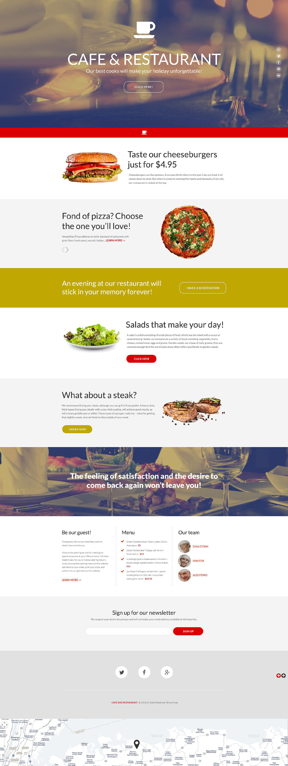
Here are the 10 awesome examples of ghost buttons in use.
Great thing is – you can get any of these ready-made designs to build your website with!
Industrial Website Template

In case you’re seeking premium themes to put up your very own website, take a look at industrial WordPress themes.
Architecture Design Joomla Template

We would also recommend you to view architecture WordPress themes in case you need a wider choice of website building solutions.


