5 Great Features to Include in Your Mega Menus
Mega menus are an effective way to provide website visitors with expandable navigation choices. Some websites have so many categories and sections that they need to use mega menus, which appear more organized and concise.

The expandable menu displays in a two-dimensional drop-down layout, often divided into groups of navigation choices. A mega menu makes everything visible simultaneously, based on navigation. If the visitor has to scroll, it’s not a well-organized mega menu. A hover, click, or tap should be all that’s needed.
There are a variety of websites that utilize mega menus wonderfully, helping visitors to easily find what they’re seeking. Five great examples of mega menus, showcasing five great features, are:
Category Breakdown with Icons
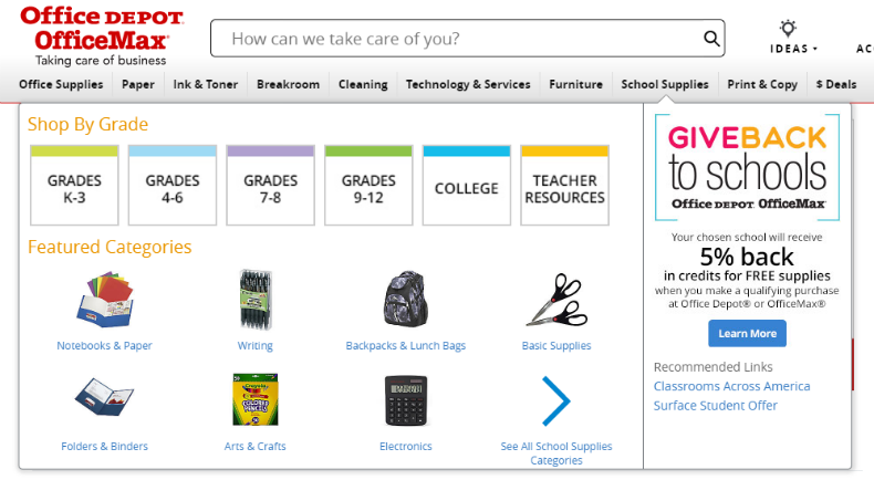
Categories and icons are both features that make navigation easier for visitors. Office Depot’s “School Supplies” menu has a nice “shop by grade” feature. The clarification makes shopping for grade-appropriate supplies a breeze. Additionally, for those seeking more general supplies, Office Depot also lists items like “Notebooks & Paper,” “Folders & Binders,” and “Backpacks & Lunch Bags” with their respective photos. With such an easy-to-use, well-designed layout, buyers will have no issue finding what they need.
Color Filters
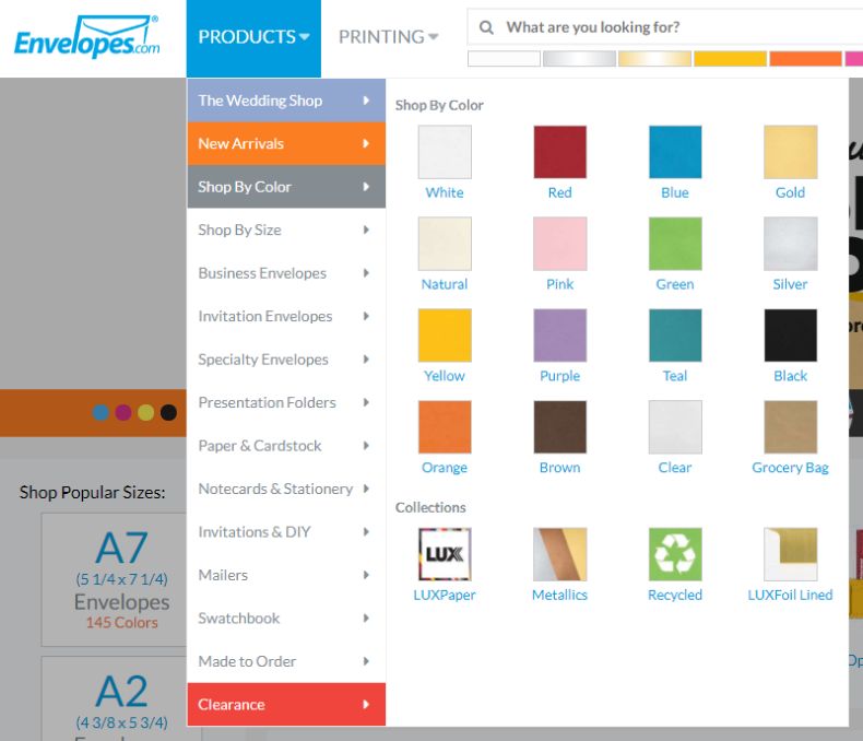
Whether a website is for a car dealership or a wallpaper business, its colors are important. The “Shop by Color” menu on envelope retailer Action Envelope has color filters that are immediately enticing to visitors. Usually, when shopping for envelopes, customers have some idea of what color scheme they enjoy. The same applies to any products with color. The color bar’s sleek placement under the search bar makes it impossible to miss, as well.
Coupons or Special Offers
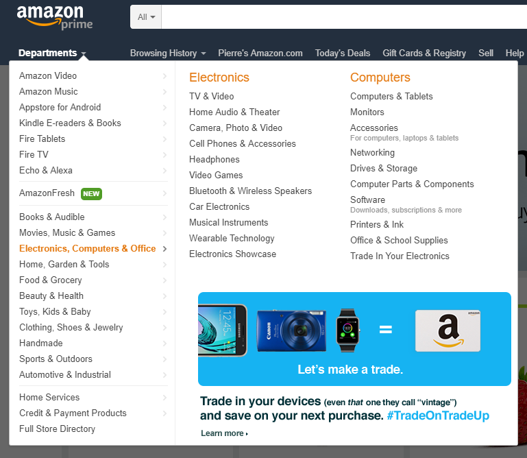
The Amazon mega menu changes frequently, though you can often see how they wisely incorporate coupons or special offers into their mega menus. Presently, the electronics aspect of their menu has an effective image in the bottom right that explains a discount for trading in old electronics. Office Depot did something similar, noting a back-to-school sale within their “School Supplies” menu.
Using the mega menu space as a way to promote coupons or special offers is wise since it’s catering to an audience already interested in the category, as opposed to a cold call. Sales and coupons have been shown to increase purchase interest among consumers when implemented effectively, so incorporating them into mega menus is often a smart choice.
Call to Action
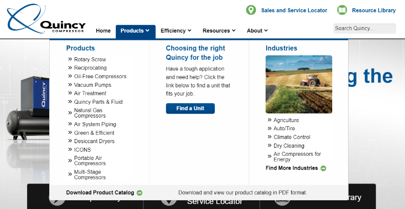
Placing a call to action in the mega menu is also a great way to get visitors to take notice. Quincy Compressor has a CTA right in the middle of their menu, which is perfect for guiding potential customers to the right product. Under “Products,” they state the following: “Have a tough application and need help? Click the link below to find a unit that fits your job.” If someone sees that message, they are already browsing for products, so it’s likely that they’ll be interested.
Sales Announcements
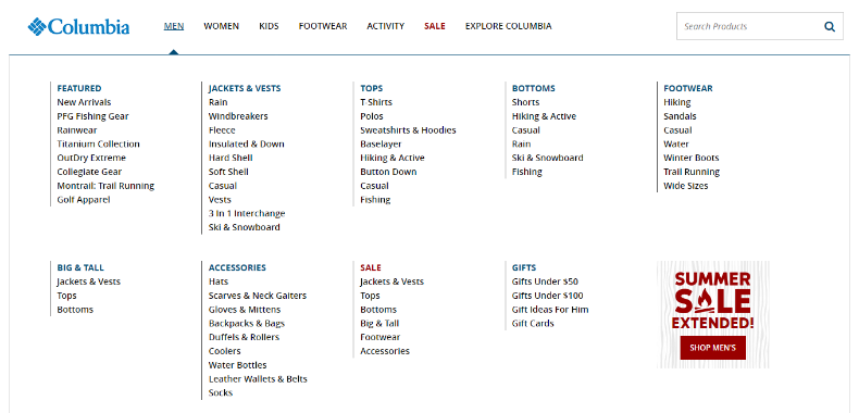
Outdoor clothing manufacturer Columbia currently has a sales announcement within each of their mega menus. In addition to using this space for coupons and special offers, promotions can also include site-wide sales. In Columbia’s case, they are holding a summer sale with 50% off many products. Since the sale encompasses every category, the announcements appear in every mega menu category.
These established businesses all demonstrate the variety of features associated with mega menus. Color filters and icon-based breakdowns make navigation easier on the eyes and more seamless, while the area can also be used effectively for calls to action and announcements regarding sales, coupons and special offers.
