Freshest Trends in Web Design, Edition 2016
Being a web designer you have to always be in tune with the latest trends, these things are like a riptide – always in motion, constantly changing, even if it looks like it’s still for a while. New technologies emerge every day, people change the patterns of behaviour online, web design is dependent on these factors, thus the trends are rapidly changing and you have to know them or stay forever behind.
2015 was quite a year for web design, in the visual part it did not offer much new things, it all stayed pretty much as it was in 2014 – mostly flat, brightly colored and with big imagery. These trends however did evolve some and we will look into these developments more closely below.
The technology under the visuals however evolved a lot, and 2016 is definitely going to reflect these evolutions. Let’s see what is going to happen next, shall we?
Responsiveness
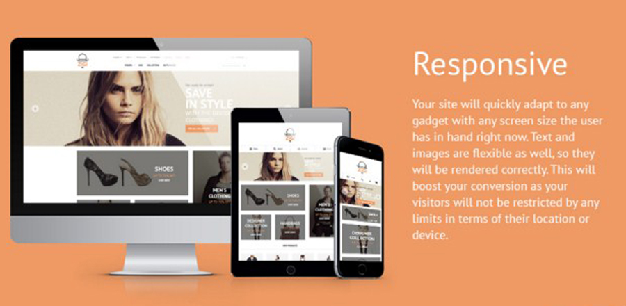
With the change in Google algorithm responsive has become not just a trend, it’s now a must. That, or a separate mobile version, or complete oblivion of your online business that is.
With the rise of demand for responsive designs, technologies that allow for creating such websites are rapidly improving and I can safely say the responsiveness will become more seamless.
CSS3
CSS3 is going to influence the design more this year, with the growing browser support for it, websites are going to become cleaner, faster and more reliable. And I’m petty sure we’ll see more creativity in layouts, what with the free time and effort CSS3 creates for the developers.
Parallax and Other Animated Effects
People always loved moving pictures and animated effects, but with flash falling out of grace there’s been a void in this matter. Now however the technologies allow for creating breathtaking animations and the browsers support them more willingly, so this is definitely an exciting thing to look forward to.
Material Design Will Rule the Industry
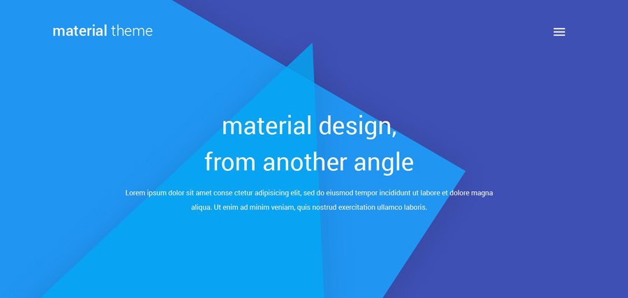
Over the year 2015 Material was probably the most distinctive change in the visual aspect of web design. Google has been a trendsetter for many years now and their Material Design is definitely going to see even bigger rise in popularity in 2016.
Bold Colors and Typography
This point stems from the above one really. Bright, vivid colors and bold typography are both distinctive parts of Material style. Though I’m pretty sure these two will be seen more with other styles as well. Why? Well, try browsing a bleak website with small text from your smartphone. That’s my point.
Hero Images
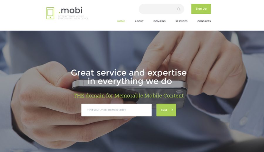
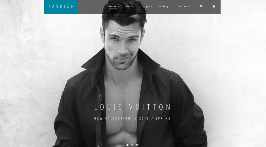
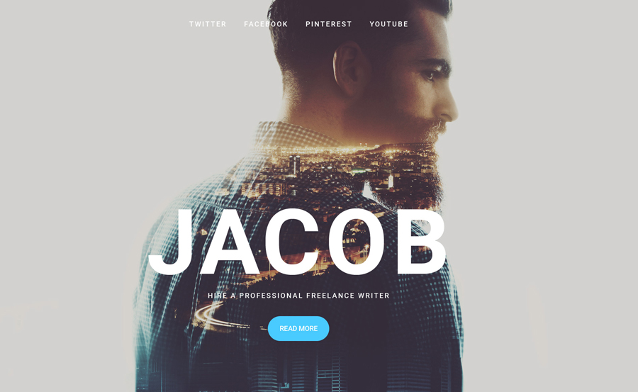
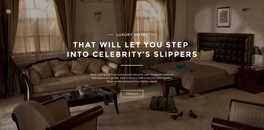
Hero images have proven to be one of the best attention grabbing tools. Thanks to the ever evolving technologies, advances in data compression and bandwidth it’s safe to say hero images are going nowhere, more like getting bigger really.
Minimalistic Approach
Less is more, this is more and more the case when it comes to web design. Stripping your website off everything but essentials provides your visitors with clear user experience and they tend to love that.
Hidden Navigation Menus
These are becoming more popular with the rise of the above mentioned trend I believe. For instance, hiding navigation in a hamburger menu (which itself is rather a popular trend) gives you more space, cleaner and sleeker design and better user experience.
Ghost Buttons and Creative Icons
These two elements of design I named above will get their much deserved place among the trends this year. With the rise of mobile browsing icons are getting bolder and more significant. And ghost buttons are perfect for the minimalistic modern designs.
Hover-Over Effects
This is a great playground for designers. Hover effects create a greater intuitive feel for the user and thus better user experience. An user experience is really the biggest trend of them all.
We would also suggest you to check out the latest collection of design WordPress themes to build your very own website.
These thoughts above are only my own predictions based on observations, research and experience. So, what do you think?

