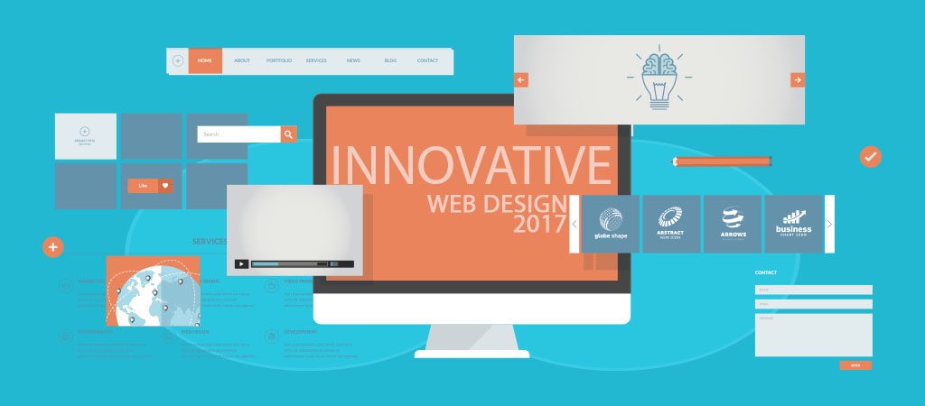
WEB DESIGN TRENDS 2017
Just half way through the year, we’ve already witnessed a lot of digital technology changes and development in many creative fields, especially when in web design. Frankly speaking, no other design industry has outpaced this field in terms of innovation and experimentation. Whether you are a webmaster or designer, there has never been a better time to keep brace up in this field than now.

Every year, new trends and ideas are introduced, sometimes, making the ones of previous years almost irrelevant. Just like an ardent casino player will want to know about the top online casinos at SpinSlot, every web designer must also know about the new trends in the industry. Let’s quickly look at the most popular design trends that have been making waves this year.
Cinemagraphs
Nowadays, “cheesy” stock photographs and peculiar videos don’t work with websites. They are often ignored by most users. As a result, most designers now go for cinemagraphs and authentic photographs as a way of adding interesting visual effects to static web pages. The use of such high-quality pictures and videos (especially GIFS) adds beauty to a website. Most web users are usually attracted to such effects and tend to take more than just a quick glance.
Open composition
Before 2016, statically closed compositions were predominantly used in web design. However, it was not until 2016 that many web designers started trying out a different style.
Open compositions involve displaying loosely suspended elements on various parts of the screen fleeing here and there. This style of distributing elements has grown since last year to become one of the most important trends in web design today.
Asymmetry
Frankly speaking, the rule of symmetry, which like many other aspects of web design has dominated the industry for a while. It was not until last year before some designers started experimenting with a different way of creating layouts and arranging elements. Asymmetric design, although not a “boom” yet, is gradually swooping the arena since the beginning of 2017. We have already seen some nearly perfect jobs in this area on many popular websites.
Mobile first approach
Although the mobile-first approach is no longer a “new” trend in web design, it is still very popular and will continue to be as long as mobile phones remain. However, it seems 2017 is going to be the epic year as it is now very difficult to find any website that is not optimized for mobile. This is in keeping pace with the trend in responsive design, which is now a fundamental aspect of web design these days.
It is even more interesting considering the fact that mobile phones are now officially recognized as the primary devices for surfing the internet.
Minimalistic Design
Gone are the days of “too much colour”, simplicity is now the key. From menus, navigations, to cards, everything is now kept as simple as possible. This approach helps to make the website more informative rather than being clustered with elements, which are not helpful or visually attractive to users.
The trends mentioned above are worth being considered by every web designer. However, there are other amazing trends for 2017, which were not mentioned. We expect to see more before the year runs out.
